WhiteKnuckle to Jones Playing Cards- part 1
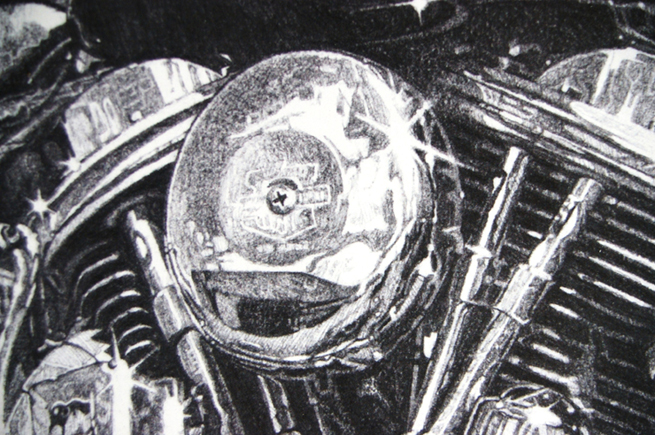
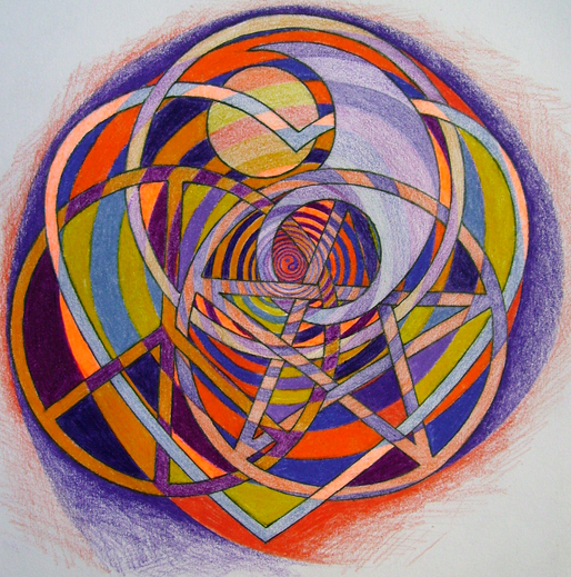
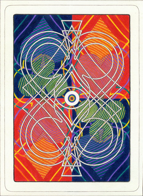
I had done nothing but freehand hyper realistic drawings of mostly motorcycles for a few years straight (figure 1) and was just having a bit of a break before starting the next sanity warping highly detailed drawing project of that ilk. I was fiddling around with graphite and coloured pencils doing an intertwined kind of style I had been fascinated with ever since filling in all those long boring school days doodling in my books instead of paying attention, and had started and finished a bit of a scratch around involving a whole bunch of symbols all intertwined through each other with a coloured spiral running through it all in different shades of purple and orange (figure 2).
fig 1: A detail crop of one of the freehand hyper-realistic works in graphite that are the 'normal' stock-in-trade of Sea of Pain Fine Art Productions.
fig 2: Perfect starting point for the coming WhiteKnuckle storm.
It was an extremely welcome drawing holiday from my usual freehand hyper-realistic madness and it turned out happily enough. I was sitting at my drawing board staring at it madly trying to work out a productive reason to launch into more pieces in the same vein, when out of the blue the phone rang. I was lost so deep in thought I almost jumped out of my skin.
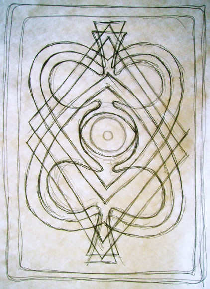
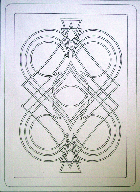
It was Bruce Rendall, an old friend I hadn't heard from for years calling me from Sydney asking if I thought I could improve on a standard deck of playing cards. It was a pivotal moment in time for Sea of Pain Fine Art Productions. A rough deck design plan had already started falling together in my head before the phone call ended, and by the time I got up the next morning after a sleepless night of swirling mental images the foundational bones for the entire deck design had emerged, connected, organised and clarified in my mind's eye for the original WhiteKnuckle New Standard deck (1-10). (figures 3, 4, 5, & 6).
From that point in time back in early 2007 right up until this moment, playing card design has been a constant and ongoing presence in my mind and studio.
fig 3: Rough concept sketch for WK cardback.
fig 4: Start of serious layout for WK cardback involving the celtic knot linework aspect.
fig 5: Finished drawing of WK cardback in graphite and coloured pencil, all ready for scanning into the Photoshop monster for the next stage of the process, refining and clarifying every line by hand with graphics tablet and pen.
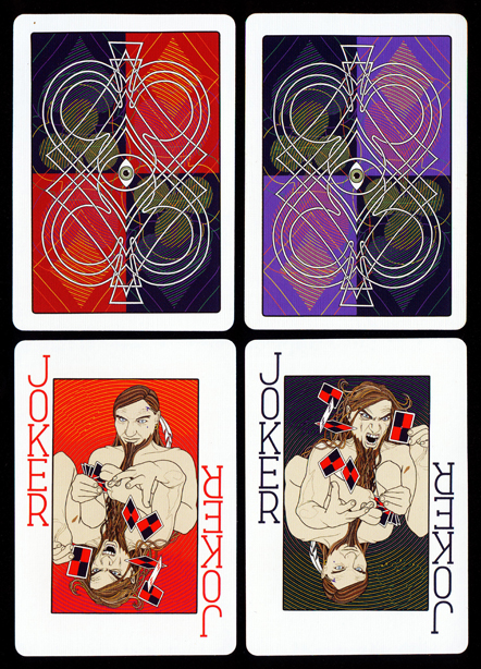
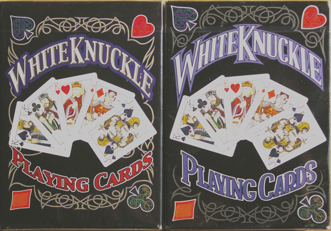
fig 6: Hi-res scans of actual WK cardbacks (red and blueback versions) on USPCC Bicycle 808 cardstock. Design is very noticeably off centre and a bit crooked as well. Two bottom cards are original WhiteKnuckle jokers, which have evolved profoundly for the Jones Playing Cards.
Doing Deals
The actual deal settled on a couple of days later over the phone with Bruce was that I would be wholly responsible for all the creative work on all face designs, cardbacks and tuckboxes and he would be in charge of all the capital financing, overseas marketing, interacting with USPCC, and everything concerning getting them to overseas wholesale pre-order buyers and freighting the remainder of each edition to Australia, and we would split any and all profits 50/50 after all production and freight costs were covered.
The only change to that initial beautifully simple agreement was that once the remainder of each edition not presold overseas made it to Australia we would go halves in those decks and I would pay him the production cost of my half and half the cost of freight from the USA plus the freight from Sydney to my studio in Hervey Bay, Queensland and we would each dispose of our half of the Australian stock in our own territory however we saw fit.
Serious Work Underway
It took pretty much all of 2007, 2008, and 2009 to start and finish the WK deck design in its entirety and get it all onto USPCC's digital templates (figures 7, 8, 9, 10, & 11). Despite the seemingly foolproof simplicity of the agreement between Bruce and I, as time passed and pressure increased I found it increasingly frustrating to have to try and get the designs print ready for production with no direct communication whatsoever with USPCC and no control at all over how the designs were set on the digital card templates. Bruce also found it increasingly difficult and frustrating not only as far as the time it was taking but also to not have any kind of control over the way the designs were developing artistically from a thousand kilometers away. The original deal clearly separated our respective parts of the project once the project was underway in earnest but like most things in life wasn't as simple as we thought.
I was to have no communication whatsoever with USPCC or anyone else involved and Bruce had no editorial say over the design aspects or right of refusal over production once so much studio time and effort had been directed toward all the research and design (and away from all my other work). The seeming simplicity of this appealed to my strange brain very much and was the only reason I agreed to go ahead with such a huge undertaking in the first place.
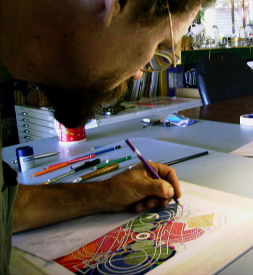
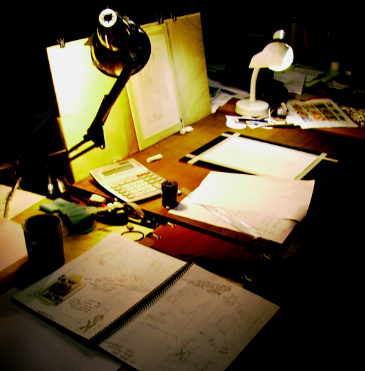
fig 7: Working on WK cardback using the only program which always 'works' and I really do understand how to use well (eyes, fingers, pencils, and paper).
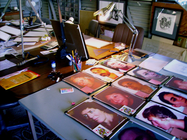
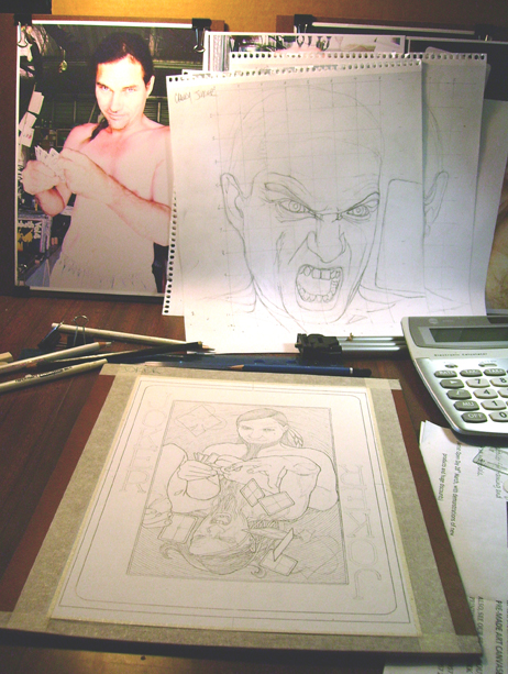
fig 8: The start of the court card drawing stage with the reference photos of all twelve court faces printed out ready to be freehand sketched into linework drawings that can be utilised on the actual court card design drawings.
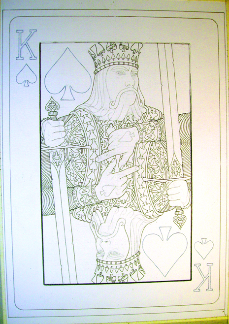
fig 9: King of Spades underway with all the research notes close to hand.
fig 10: The joker drawing layout well underway.
A Name for the Madness
While I was directing all my focus and time toward creating the original deck design, Bruce concentrated on establishing contact with potential clients and negotiating as many wholesale gross box pre-orders as possible all over the world, and developing his own website all about playing cards and card game rules. Neither of us could think of a good name for this all new revolutionary standard deck design being created from scratch, my life back then was in many ways very dark, tenuous and tumultuous with much intense physical pain, poverty, and mental anguish my constant companions for many years. In fact nothing but one big fat white knuckle ride to hell and back to be completely honest.
In the end I suggested to Bruce that maybe Whiteknuckle Playing Cards would serve well enough as a name for them. He agreed that it was a better name than anything else either of us had floated up till then so WhiteKnuckle it was (figure 12). Bruce's website was subsequently called WhiteKnucklePlayingCards.com and has gone from strength to strength ever since with astonishingly massive amounts of time, research and work put in by him to create and develop what has become a very well know and amazingly detailed and accurate record and compilation of card history and a card game encyclopaedia which has since become something of an institution and trusted reference source to the playing card world with many Wikipedia endorsements and references originating from it.
fig 11: Deciding which two colour celtic pattern will go on each of the 104 individual suit symbols (index and spot) in the deck, using old school (actual) cut and paste method, like the way they used to do newspapers and magazines.
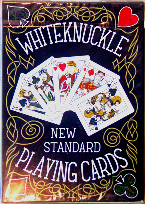
fig 12: The original WhiteKnuckle 1-10 New Standard tuckbox. The lettering was done exactly the same size and style as the card indexes. I'm not sure anyone ever spotted that particular design touch.
Vertical Learning Curve
Because my modus operandi has always been to create everything completely freehand and original with absolutely every line and mark drawn by hand, every aspect and stage of the WK's was incredibly time consuming on every level (figures 12, 13, 14, & 15). Partly because of the blank paper and pencil start and partly because I had to figure out how to acquire and use a computer, a scanner, a graphics tablet, Photoshop etc, etc, etc. with all but no previous experience with such devices and no one to ask, not to mention the months of intense playing card research and concept development before I could even seriously engage with pencil and paper let alone the graphics pen and computer screen.
I had to borrow money to buy the computer, the scanner was a $30 job from Aldis (it turned out to have astonishingly high resolution capability), the Graphire 3 graphics tablet and pen were sourced second hand from e-bay and the "Photoshop" programme used for the entire WK project was Elements 2.0 which came free with the graphics tablet driver disc, it was about the oldest and most basic Photoshop programme of all. The good people at USPCC must have shook their heads in horror and wonder at the Aussie hillbillies sending them finished card designs in Elements 2.0 format. Because they were all drawn entirely by hand in pencil and then every line, colour and detail refined by hand (over and over and over) with the graphics tablet and pen, each of the card designs only had one layer, including the very complex card back designs.
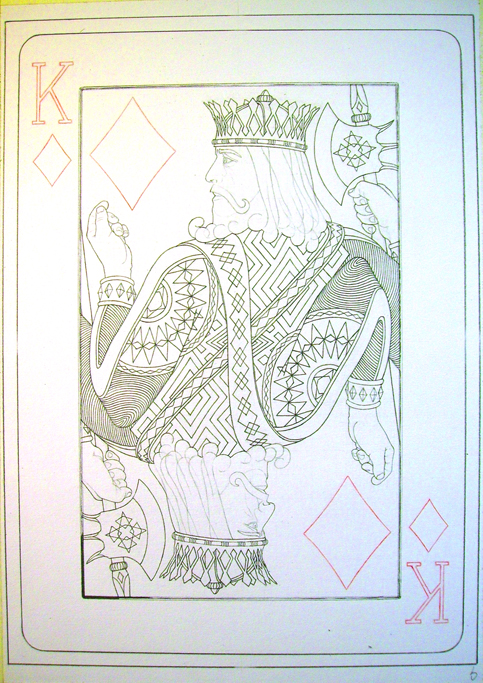
fig 13: The King of Diamonds pencil layout in progress. All elements of the design were a challenge but the courts were unsurprisingly the most difficult by far.
fig 14: The King of Spades in progress. Even the black borders were done entirely by hand, in pencil and then again with graphics pen. Definitely a case of mixing profound digital ignorance and a very strange brain setting the design parameters and creative processes.
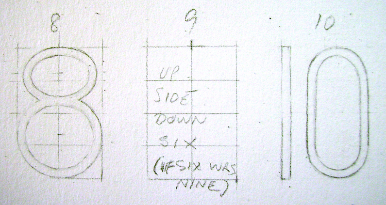
fig 15: Index number design in progress. If six were nine, I don't mind.....I don't mind. I might be a crazy purist freehand old-school fine artist but even I was ok with flipping a six to make a nine. A great deal of tortured consideration went into designing the index letters and number from scratch with the only imperative being ease-of-use as playing cards. Oh yeah, they had to of course appear balanced and an obvious part of the overall aesthetic style as well. They also had to be in exactly the right place but I had to wait ten years till the Jones Playing Cards came into existence to have that particular O.C. itch scratched.
Hillbilly Dinosaurs
USPCC asked for all the layers for each card design, in fact were most insistent that they were required to proceed further. When told they already had all the layers (i.e. one for each card design) I can only imagine what they thought. I was such a Photoshop greenhorn back then I honestly didn't even know what a layer was let alone how to use multiple layers, all I knew in those days was that when what you were drawing didn't seem to be sticking on the screen anymore it was time to push the "merge visible layers" button to be able to continue moving forward with the graphics tablet pen. I was really using Photoshop as nothing more than a digital freehand drawing board (figure 16).
As the months turned into years and the pressure intensified to pull all the many threads together into a finished and complete "template ready" deck design I put more and more hours per day into feverishly scratching away with the computer pen and less and less into things like eating, washing, sleeping, and communicating with the world outside the studio until I reached the point I was opening my eyes, rising and walking straight down to the graphics pen and screen, putting at least 16 hours in, sometimes more, dropping the pen and trying to make it back up the songline to my bed and falling asleep with half chewed food in my mouth (figure 17). A few times I actually collapsed from pain and exhaustion and went down on the track between studio and workshop and couldn't get back up for a while and just laid there watching the sky spin. It's a good feeling to know nothing was left in reserve when all is on the line between having a win or a fail. I'll never forget that period of extreme tundra trudging, not that I haven't lived in that world ever since, just one step back from that intentional insanity.
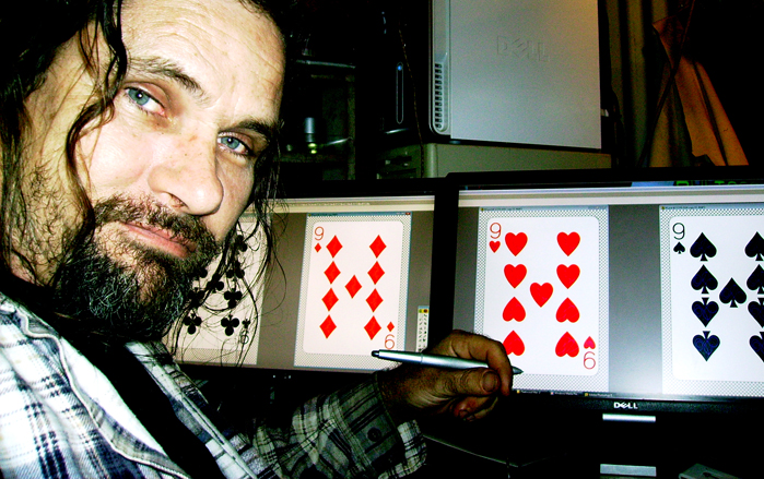
fig 16: The seemingly endless digital tundra trudge well underway, changing every single scanned pencil line into a clean digital line one at a time with the graphics pen. This is a small section of the King of Diamonds blown up large to make it possible to manipulate the graphics tablet and pen effectively.
fig 17: Years later tidying up loose ends before pre-production with USPCC. This was deep in the desperate exhaustion period when all I did was hammer away at the card project to the utter exclusion of everything else, with damaged vertebrae grinding together in my spine over a long period separating me very effectively from the rest of reality. The studio manager got seriously involved in all Sea of Pain projects around the late 2014/early 2015 mark. This shot was taken in 2009. Most of my life as an artist has been a one man operation, often many weeks in a row passing between seeing another human or hitting town for food, diesel and dog bones.
Catastrophic Art Limit Line
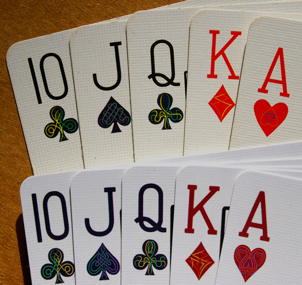
Evennnn...tually all the cards and all the box panels were finally "template ready". A very large problem arose once Bruce had loaded them all onto the USPCC digital templates. The size of the actual designs in relation to the card size itself became a nightmarish sticking point I had no control over. USPCC's digital templates had/have a dotted line quite a ways in from the card edge. According to them no part of the designs whatsoever should end up outside this "art limit line". Unfortunately this immediately created a huge remove between how I wanted the designs to be scaled and positioned on the cards and what was evidently possible. As it turns out you can choose to extend the artwork (just the indices really, nothing else came even close to "crossing the line") but if you do decide to hoe that particular road USPCC tell you in no uncertain terms that they'd prefer you didn't as once you add their die cut drift tolerance of 1.6mm in any direction you are in danger of creating a very noticeable difference in the gap between indices and card edge on either side of the card . If you don't cross the art limit line the space between index and card edge is 4mm or more, the reasoning being that any drift difference is less noticeable that way . As far as I'm concerned that is fully twice what is aesthetically and functionally acceptable in a deck of correctly proportioned playing cards whose main purpose is card play (figure 18).
fig 18: They say a picture's worth a thousand words. This one says it all. The top hand is WhiteKnuckle cards on Bicycle 808 stock, the bottom one is Jones Playing Cards on LPCC's premium Diamond Finish stock. My soul relaxed back towards sanity when I finally managed to get the card edge to index gap set the way I always wanted on the JPC decks. Suit symbols are difficult to aesthetically balance against each other as they are all different shapes and proportions, the clubs are widest, they had to be no more than 2mm from card edge, spades and hearts 2.5 and diamonds a tiny bit more. I cared about this aspect more than any other in the entire deck design, and that's saying a lot. It was an extraordinarily difficult thing to achieve in the reality of production, every card design in the deck had to be refined within one pixel over 600ppi (pixels per inch) at A4 canvas size to have even the slightest hope of pulling it off. To sum up: top hand very bad proportionally, bottom hand very good. Simple as that. Sorry Bicycle.
Crossing the Line
It was possible to extend the designs enough past the "art limit line" to try for a nominal 2mm card edge gap but with the 1.6mm die cut tolerance thrown in the mix there is a chance you could end up with the indices touching the edge or even partially cropped on one side and a big fat white gap between index and card edge on the other, with no way to tell which decks if any are flawed once sealed and cellophane wrapped. The drift could turn out to be non-existent or minimal (the more than likely result) but if you did end up with the full 1.6mm drift it translates to a possible maximum visually noticeable difference between the two edges of 3.2mm. If you still want to risk it anyway (I did) you have to sign a legal release declaring you understand and accept the risk of the worst case scenario occurring and having to pay for a deck edition in which at least some of the decks indices touch the card edge or are even cropped.
Roll Dat Dice
I very much wanted to roll the dice anyway, or at least push the limits of what was possible/practical but that particular decision was Bruce's to make with the WhiteKnuckles so the conservative road was taken with all designs staying within the art limit line. This translated in real terms to the horribly huge 4mm+ space between index and card edge, and the necessity (as Bruce saw it) of actually moving the indexes much higher on the designs than was ever intended to prevent the gap from the indexes to the top of the cards becoming instantly ridiculous. The entire design on every card appeared much smaller on the actual card because of this, making them look insipid as well which threw out the overall aesthetic balance even more, making the whole deck design just look fundamentally wrong to me. I had extremely carefully and intentionally set the thicknesses of all indexes and lines/outlines, overall proportions/scale and particularly importantly the space between index and card edge so shrinking them into the centre of the cards to keep them inside the art limit lines even made the index letters and numbers appear finer than intended. The WK card-back also suffered from the same issue, with a far thicker white border than was ever intended in the original design vision.
Sandwich Ham
Poor old Bruce ended up being the ongoing ham in the sandwich between USPCC and SOPFAP, much ongoing angst and tension for all concerned being the result. It was very interesting and educational to see the extent and variation in actual die cut drift throughout each individual deck and throughout the three WK print runs, some were perfect and some were so far out I felt bad selling them, of course you can't tell the die-drift on a deck until you split the deck seal. I had studied many and various USPCC decks from the past and the present and couldn't see any drift at all by eye, I put it down without knowing any better to them making fine adjustments to their own decks from edition to edition to tweak them into the perfect position over time. I now think it was more a case of the WKs being one of the very first deck editions to come out of the Erlanger, Kentucky plant they had recently moved to from the very long established Cincinnati, Ohio plant and that all their old and very well used manufacturing machinery must have got a good rattle up during the big move. I'm only guessing though since I never contacted them personally as per the original agreement with Bruce. Nowadays from what I've seen, USPCC propriety Bicycle decks including ALL of their custom decks (of which there are now very many and more all the time) have excellent (i.e. no) die drift, so I'm pretty sure the world's moved on in that regard at USPCC since the WK days, but that onerous art limit line is still part of the digital template and customer conditions to this day.
Very Disturbed
The first time I ever slid a deck of actual WK playing cards out of the box I remember being very disappointed and disturbed by that 4mm gap and the "shrinking" of the designs overall and while certainly not the only reason I was compelled to re-create them as Jones Playing Cards it was most definitely No.1 on the list of improvements to be made. The original plan was to publish the first WK edition (1-10 New Standards) and then develop the deck from there into the future. Bruce always made no bones of expressing a serious dislike for various parts of the original design including the tuckbox, the cardback design and the fact I called the first edition the "New Standard" deck, amongst other things. Because the first deck (1-10) had the horror 4mm edge gap we had to stick to that for the following two editions as well (2nd redback 2-10 and blueback 3-10) for continuity (figure 19). Despite my intense dissatisfaction with that 4mm edge gap result and Bruce's well established disquiet on certain aspects of the deck and the tuck, within weeks of being released they had not only been noticed by the playing card world, they made deck of the month in the Netherlands and were declared "the most beautiful deck design in the world" by the Siberian Museum of Playing Cards amongst much other praise, accolades, and sales (figure 20). All of a sudden everyone seemed to have heard of and liked the WKs from one side of the world to the other (something a lot easier done in 2010 than 2016 as it turns out).
fig 19: The WhiteKnuckle 2-10 redback tuckbox on the left. "2-10" doesn't actually appear on the bottom of the tuckbox like the 1-10's and 3-10's. Ask my O.C. brain if this bothers me????, and the final third WhiteKnuckle edition on the right, the 3-10 blueback.
1-10, 2-10, 3-10
Three WhiteKnuckle editions were published in 2010 (1-10 means first edition, published in 2010, etc). There must have been getting up towards 40,000 decks of WhiteKnuckles manufactured and sold worldwide in the end (figure 21).
I personally sold over 30 gross boxes of decks through various consignment and retail outlets between 2010 and 2014 just in my local region of Wide Bay, Queensland, Australia. I had always intended to develop the deck design further and originally it was part of the WK plan but by the time Bruce had financed, manufactured and globally distributed three WK deck editions in the same year he had very successfully fulfilled his original goal of publishing a new more lifelike take on a standard deck of English playing cards and didn't want to continue further. His efforts and commitment were excellent and exhaustive but by the end of 2010 he had had enough.
Bruce and I went our separate ways on good terms with all creative and financial obligations and commitments fulfilled. By then I had already done hundreds more hours of developmental work on the design which had evolved into a comprehensive and all encompassing deck re-development.
The WhiteKnuckle era had ended and the Jones Playing Cards one had begun.....
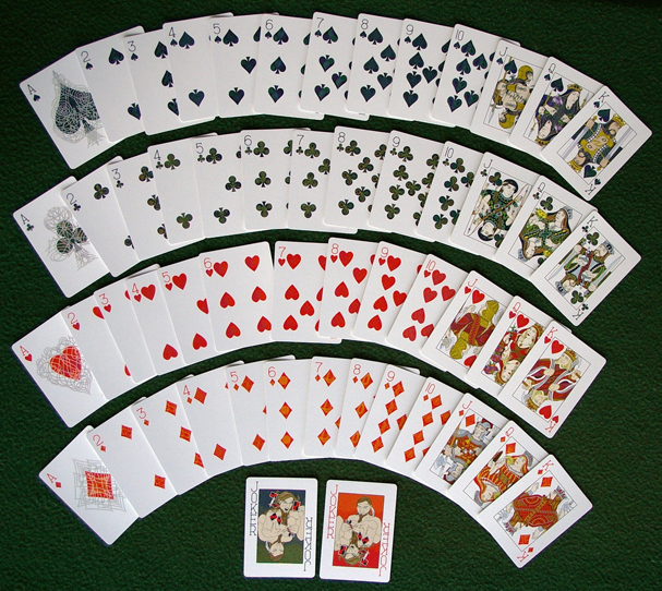
fig 20: WhiteKnuckle face design laid out. The subtle colour coding utilising the Bezold effect is plainly apparent. Still a traditional "red and black" deck but enough of a tint supplied by the patterns within the suit symbols to help subconsciously identify suits during cardplay.
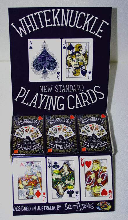
fig 21: The retail display set-up for the WhiteKnuckles. USPCC supplies decks in 'brick boxes' that hold a dozen decks. I made up a laminated 'back banner' that slipped in behind the decks and a folded laminated front piece that slipped down in front of the decks, turning the brick boxes into retail display boxes. Not an ideal solution but I managed to sell well over 30 gross boxes of decks this way over a few years from a couple of dozen retail outlets within 100 km radius of the studio.


